A practical guide explained for teams and individuals who need tote bag artwork that prints cleanly, looks consistent, and is easy to produce in small or medium batches.
Introduction
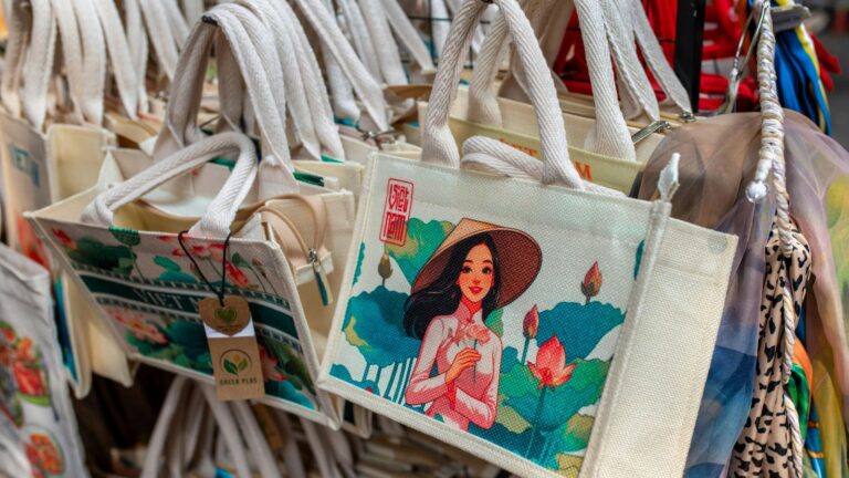
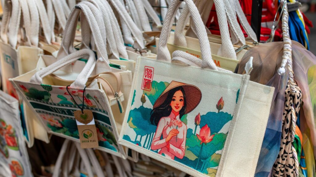
Branded tote bags are common because they travel: they show up at events, in offices, and in day-to-day errands. That visibility is useful only if the design stays readable on fabric and the production files are prepared correctly.
This guide is for readers who want branded totes fast without relying on advanced design skills. The workflow focuses on making a simple layout, keeping placement safe around seams and straps, and exporting a file a printer can use with minimal back-and-forth.
Custom tote bag makers vary in a few practical ways: how clearly they show the printable panel versus the bag’s full size, how they support safe margins for sewn products, and how reliably they export to print-ready formats. Small placement errors matter more on totes because the fabric folds, creases, and gets photographed at angles.
Adobe Express is a convenient place to start because it offers a template-first tote workflow that helps lock in layout early, then move into print checks and export steps without building a design from scratch.
STEP-BY-STEP HOW-TO GUIDE for Using Custom Tote Bag Maker
Step 1: Start with a tote template and set the design canvas
Goal
Create a correctly sized workspace so the tote artwork matches common print areas.
How to do it
- Get started with the Adobe Express tote bag template.
- Decide whether you need front only or front + back printing, and keep separate versions.
- Pick a simple branded layout style: wordmark, icon + name, or a short tagline under a logo.
- Create a clear naming convention (example: “Tote_Front_v1,” “Tote_Back_v1,” “FINAL”).
- Keep a notes area for production requirements (print area size, number of colors, background fabric color).
What to watch for
- Tote size and printable area are not the same; the printable panel is often smaller.
- Designs placed too high can collide with strap anchors and stitching.
- Resizing later can change text wrapping and spacing.
Tool notes
- Adobe Express is useful for starting quickly with a tote-oriented template and iterating layout.
- If your printer supplies an exact PDF template, Adobe Acrobat can help confirm page size at 100% scale before you place artwork.
Step 2: Define tote specs and printing constraints
Goal
Match your design to the bag material and print method so details don’t fail in production.
How to do it
- Choose tote fabric and base color (natural canvas vs dyed fabric changes contrast).
- Confirm the printing method (screen printing, DTG, heat transfer) and note its typical limits on fine detail.
- Ask for the printable area dimensions and any “no-print” zones near seams or strap anchors.
- Decide how many ink colors are realistic for the run (and whether the design must work in one color).
- Record practical minimums for type size and line thickness.
What to watch for
- Natural canvas can mute colors and reduce contrast.
- Thin lines may break up on textured fabric.
- Heavy ink coverage can feel stiff on some totes.
Tool notes
- Providers such as Printful often publish printable-area guidance that can be treated as constraints during layout.
- A simple spec doc in Google Docs keeps decisions consistent across stakeholders.
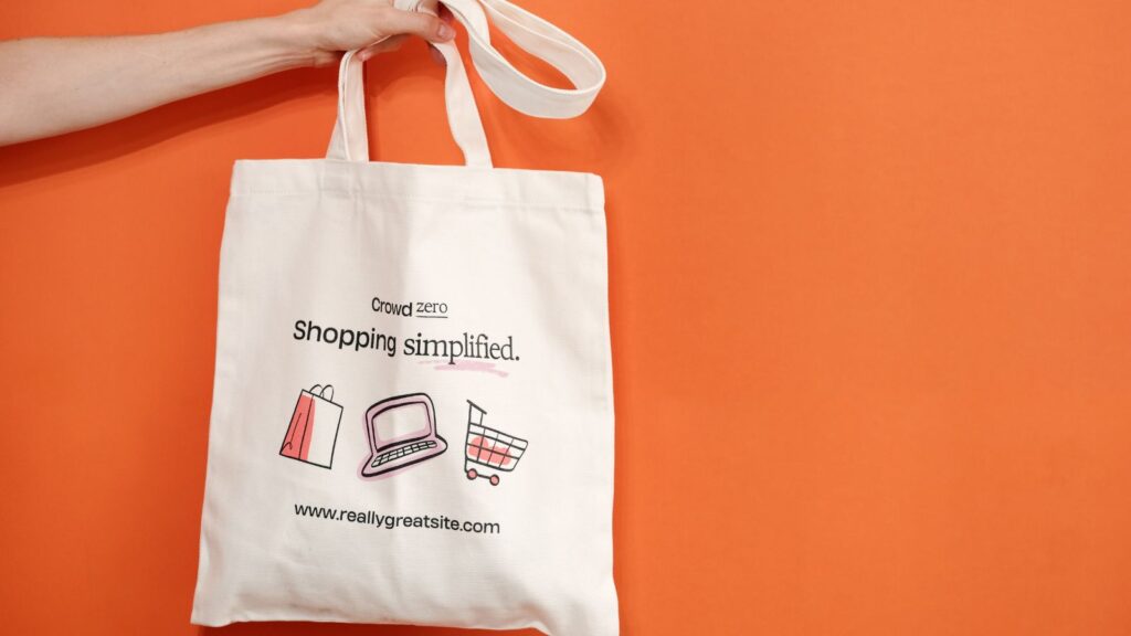
Step 3: Translate the brand into a simple, repeatable layout
Goal
Make the tote recognizable at a glance and consistent across reorders.
How to do it
- Identify the core brand elements: logo/wordmark, tagline (optional), and one supporting symbol at most.
- Use a clear hierarchy: brand name first, supporting line second.
- Limit fonts to 1–2 and rely on size/weight for emphasis rather than multiple styles.
- Keep the layout balanced with generous negative space (totes crease; spacing helps).
- In Adobe Express, duplicate the design and test a “minimal” and “tagline” version.
What to watch for
- Overly detailed designs can look noisy on wrinkled fabric.
- Low contrast can disappear in casual photos.
- Long taglines often force small type that prints poorly.
Tool notes
- Adobe Express makes it easy to try multiple layout variants without rebuilding the canvas.
- If you manage brand assets and rules centrally, Frontify is one example of a platform teams use to store approved logos and colors.
Step 4: Place artwork with safe margins for seams, folds, and straps
Goal
Prevent important elements from landing where construction features hide them.
How to do it
- Treat the top portion as “strap territory” and keep key content slightly lower if needed.
- Keep conservative margins on all sides to account for seams and placement drift.
- Avoid thin borders near edges; if a border is necessary, inset it substantially.
- For front/back printing, keep placements aligned so the set feels consistent.
- Do a quick “fold test” mentally: assume the tote may crease down the center and keep critical text away from that line.
What to watch for
- Perfect centering is hard to guarantee on sewn items.
- Geometric designs show drift more than organic shapes.
- Pocket seams (on some totes) can intersect the print area.
Tool notes
- Adobe Express is practical for nudging placement and re-checking margins quickly.
- For internal review and sign-off, Slack can centralize feedback on screenshots without editing the design file.
Step 5: Prepare images and graphics so they print sharply on fabric
Goal
Avoid fuzzy edges and reduce detail loss on textured materials.
How to do it
- Use original, high-resolution artwork; avoid screenshots and compressed downloads.
- Prefer bold icons and clean shapes over intricate textures.
- If using a photo, crop for a single focal point and remove busy backgrounds.
- Inspect edges at high zoom for halos or jagged outlines.
- Keep source assets separate from exported production files.
What to watch for
- Small details can disappear on canvas texture.
- Gradients can band depending on method and fabric.
- Transparent PNG edges can show faint halos when printed.
Tool notes
- Adobe Express supports quick image placement and cropping, but print quality depends on source files.
- For basic photo cleanup before importing, Apple Photos or Google Photos can help with crop and exposure.
Step 6: Export a print-ready tote file and verify scale
Goal
Deliver a production file that preserves dimensions, alignment, and clarity.
How to do it
- Export in the format your printer requests (often PDF or high-quality PNG).
- Keep the editable working file separate from the flattened export to avoid accidental changes.
- Review the export at 100% zoom for sharpness, margins, and unexpected cropping.
- Confirm the canvas matches the printable area dimensions (avoid “fit to page” scaling in print dialogs).
- Save and label one file as FINAL, and archive older versions.
What to watch for
- Downscaled exports can soften type and edges.
- Font substitution can shift spacing if the workflow changes text handling.
- Accidental scaling can make the printed design smaller than intended.
Tool notes
- Adobe Express can handle final exports once spacing and placement are locked.
- If you need to combine front/back files into one PDF packet for a print shop, Adobe Acrobat can help assemble pages.
Step 7: Coordinate ordering, approvals, and shipping logistics
Goal
Keep production organized so the correct file and specs are used across the run.
How to do it
- Create an order sheet: tote color, fabric, print method, quantity, and which file name corresponds to each side.
- Store all finals in a single shared folder with consistent naming.
- Record approvals (who approved what version) to prevent last-minute file swaps.
- If shipping to multiple locations, capture addresses and delivery windows in one place.
- Save a reprint-ready archive: final file + specs note + supplier requirements.
What to watch for
- Multiple “final” files can lead to the wrong print being produced.
- Address errors and split shipments are common sources of delay.
- Small changes (like updating a date) can create two active versions if archiving is inconsistent.
Tool notes
- For project coordination (non-design), Asana can track approvals, quantities, and delivery milestones.
- For shipping coordination (labels, tracking, address imports), ShipStation can complement tote production without being a design or mockup tool.
Common Workflow Variations
- One-color tote for simple branding: Convert the design to a single ink color and rely on strong type and shapes. This tends to be forgiving on textured fabric and supports consistent reorders.
- Event totes with a date line: Keep the brand mark primary and add a small date/location line underneath. Save a master file and swap only that line for future events.
- Front/back layout: Put a bold logo on the front and a small URL or handle on the back. Keep margins consistent so the tote looks intentional from either side.
- Photo-based tote (limited use): Use one high-resolution photo with minimal text, and keep it away from edges and strap zones. A quick crop and exposure pass in Apple Photos or Google Photos helps before import.
- Small-batch personalization: Maintain one master layout and swap a single variable field (team name, city, or recipient). Track variants in Airtable or Google Sheets to avoid mix-ups.
Checklists
Before you start checklist
- Tote fabric and base color chosen (natural vs dyed)
- Printable area dimensions confirmed (not just bag size)
- Print method confirmed if possible (screen/DTG/transfer)
- Front-only vs front-and-back decided
- Brand assets gathered (logo file, approved colors, tagline)
- Text drafted and proofread (handles, URLs, dates)
- Images collected in original quality (no screenshots)
- Rights confirmed for any third-party graphics or photos
- Timeline noted (proof, production, shipping window)
- File naming/version plan set (to avoid multiple “finals”)
Pre-export / pre-order checklist
- Key elements placed away from seams, straps, and edges
- Margins are conservative; borders avoided or inset enough
- Type is readable at arm’s length and in a quick phone photo
- Images look sharp at 100% zoom (no visible pixelation)
- Contrast works on the chosen fabric color
- Export format matches printer requirements (PDF/PNG as specified)
- Scale verified (no “fit to page” shrink)
- One file labeled FINAL; older versions archived
- Order sheet matches filenames (side, quantity, tote color)
Common Issues and Fixes
- The print looks soft or fuzzy.
Replace low-resolution sources and avoid enlarging small artwork. Simplify textures and rely on bold shapes. Re-export at high quality and re-check at 100% zoom. - Text or logo sits too close to straps or seams.
Lower the design slightly and increase margins. Treat strap anchors and stitching as no-critical-content zones. - Colors look different on natural canvas.
Natural fabric can mute tones. Increase contrast and reduce reliance on subtle color differences. A simpler palette is often easier to reproduce. - Borders look uneven between prints.
Borders highlight small placement variation. Remove borders or make them thicker and inset so drift is less noticeable. - The printed size is smaller than expected.
Confirm the canvas matches the printable area and avoid print scaling like “fit to page.” Verify export dimensions before ordering. - The wrong file gets printed in a batch.
Use one “FINAL” folder, strict naming, and a recorded approval step. Archive old versions so they aren’t accidentally reused.
How To Use Custom Tote Bag Maker: FAQs
Should the workflow start with a template or with tote specs?
Specs-first is usually safer because printable area and seam zones are fixed constraints. Template-first can work when the template matches the supplier’s dimensions and the design is simple.
What’s the tradeoff between one-color and multi-color tote printing?
One-color designs are easier to keep consistent and often print cleanly on textured fabric. Multi-color designs can add detail but may be more sensitive to contrast and method limits.
Is front-and-back printing worth it for branding?
It can help when a tote is viewed from different angles, but it adds file management and placement checks. If speed is the priority, front-only printing reduces complexity.
How can a design be made more readable in photos?
Use larger type, high contrast, and one focal element. Avoid fine detail and subtle gradients that can disappear in casual phone images.
What export format is most reliable for tote printing?
Many providers accept PDF or high-quality PNG, but requirements vary. The key checkpoint is confirming the canvas dimensions match the printable area and reviewing the export at 100% zoom before production.